Tattoos

This is a tale of trying to make panoramic scans of decorated limbs. It started as one of those mad musings on wether I could take a picture in a certain way, that led to a bit of a rabbit hole.

The trigger was a visit to a tattoo show. Not that I have any tattoos, but I’d never been to a tattoo show before. Fascinating place and people. But what got me thinking was how a tattooist advertises their art. They obviously take pictures, but their subject is not flat, so it’s difficult to get a picture that shows the full tattoo. ‘Easy’ I thought ‘just rotate the limb in front of the camera’. If you combined a series of strips, each one running along the length of the limb, you could merge them into a complete panorama. How hard could it be?

So the first thing I did was to photograph a beer can. After emptying it, of course – art needs its muse. I set the camera up and took a series of pictures as I rotated the can in increments. There was a problem with the lighting though – the can was reflective. So I tried a Pringles tube instead (true art involves suffering). The concept worked but I needed a better background. And I had some bits of wood in the shed and a glint in my eye…

So I made a lighting trough. I made a hemispherical-section trough, lined with white card. The plan was that I could stand the trough on end and have someone place their arm down the trough, then rotate the arm as I took pictures. The curved white backdrop would bounce my flash and even-out the lighting. So I set off to charm the proprietor of a local tattoo shop into being my subject. Luckily they had lashings of ink and were a jolly good sport about trying something new.

Arms aren’t straight, either

The first problem is that arms don’t rotate at the shoulder: they twist at the elbow and forearm. So trying to rotate an arm about its long axis causes the skin to twist. This makes it very difficult to align the images.

Plan B was to get my subject to keep his arm straight but to walk around the trough. With a bit of shuffling of the trough and camera, we got a set of images. I then cropped each of into a central strip and tried aligning them in Photoshop. I could have just let Photoshop treat them as a panorama and align them automatically, but I had the idea in my head to have the back of the hand ‘normal’ and the forearm opening like a fan above it.

I stopped before finishing the merge and smoothing the edges.

And that’s the point I stopped, because it looked like a flayed arm. The results were meant to show a tattooed arm in the round, but the final picture wasn’t pleasant. It was also a load of work to produce the images and to combine them. I was at the limits of what my kit could do. It was like being back in the days of film: I didn’t know until the processing stage (combining the images) that they would even fit together. If one shot was off or distorted, it would mean a re-shoot.

If I was going to do this seriously, I think I would have to make a scanning rig that rotated around the limb. Something like a Raspberry Pi camera (or several) with the lens masked down to a slot. Surround the lens (or lenses) with a ringlight to get even illumination. Program the system to shoot a series of stills and then feed them to Photoshop to combine as a panorama, then crop to taste. You could make several rigs of different sizes: small for a hand and forearm, bigger for an arm, bigger again for a leg and even a torso or full-body scanner. But to put that much effort in I would have to be really interested in tattoos or to be selling pictures to people with tattoos as a business to support the costs.

It also turns out that the world caught up and lapped me – what I was trying to do was a manual version of an orbital camera rig. So if I was to use something like Raspberry Pi cameras I wouldn’t be breaking new ground. It would also be a lot easier to make a video scan than to assemble still images into a panorama, but the original idea was to have a final picture that could be printed.

So that’s my gift to the world: a method of taking pictures of people to make them look as though they have been flayed. No, you’re welcome.

Those who can, teach

There’s a saying that “those who can, do; those who can’t, teach”. To which I’d answer, if you think you can do, try teaching. Think you know the exposure triangle? Explain it to a non-photographer. Try depth of field. Or try describing how lenses affect perspective to another photographer.

It’s a bit like the Golden Question. That’s about explaining to someone else what you see that makes you want to capture it. So this is the flipside: if you think you know how something works, explain it.

I’ve sat through many sessions where experienced photographers try to explain even the basics, where the result is an increase in confusion. I’ve also been taught some quite complicated things by people who knew how to teach. They helped me understand a basic model of the world within the subject, and then developed the model as I understood more. But it’s easy to think you know how the world works if you know the standard answers to the standard questions. Ask me what the aperture numbers mean on a lens and I can tell you that big numbers mean small holes. Ask me why the numbers increase in an odd progression, or why f4 is the same on different lenses, and I may not be able to answer.

This is called chauffeur knowledge. It means knowing all the words but not actually understanding what is behind them. Not that you need a deeper understanding to take good photographs. It is perfectly possible to be artistic and creative without being technical. Indeed, I’ve seen the anxiety that people can have when they feel they don’t understand how their camera works (when the self-styled gurus step in and make things even more confusing). Chauffeur knowledge can be perfectly suitable if you are driving a car. So knowing that increasing my aperture number means decreasing my shutter number is an excellent working rule that gets me through the day.

I’ve no problems with this. Where I do have a problem is the headline to this piece: when someone implies that teachers can’t do. Perhaps this gives them a smug sense of better? Or do they feel that people have to take-up teaching if they can’t be successful experts in the ‘real world’? To channel Feynman again, he said that you don’t really understand a subject unless you can explain it to someone who has no subject-knowledge. I’m not saying that you should be a technical expert, but don’t disparage teachers until you’ve tried teaching.

They lock the gate to protect the public. You will notice that the lock is on the outside.

You may have learned photography from excellent guides or be self-taught. If you want to test your understanding and have some idea of the subtle skill of teaching, try explaining what you know. And by this, don’t just replay a textbook or something you have read. Start from scratch and develop your own explanation, then test it by using it. If you can bring someone to your level of understanding in simple, logical steps, you know your stuff. And it will give you a sense of the Jedi skills of a good teacher, who can not only do but can create new doers. So how about changing the aphorism to ‘those who think they can do, try teaching’?

PS – I am not and have never been a teacher. But I know and have known some good ones. And some bad ones, obviously. But the good ones quietly make the world a better place.

More over-exposing

It took me a while, as I was mostly shooting digital, but I got around to trying more of the deliberate over-exposure as recommended by Johnny Patience.

This time I tortured some Agent Shadow 400, exposing at 200ISO and developing in 510-Pyro. Why this combination? Because I had the film to hand and the developer has become my favourite, if only for its keeping properties.

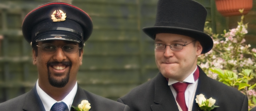
And I was impressed. One particular shot was of a couple of people talking. One was wearing a black tee shirt, the other a white shirt. This is the traditional horror of wedding photographers: how to show detail in the dress while not making the groom look like a black hole in a top hat. But the film captured gradations in the highlights on the white shirt and detail in the shadows and folds of the tee shirt. Nice.

Don’t know how well it will show-up, but there is gradation in both the white and black areas.

This was without using the full power of the 510-pyro, as I used standard Ilford agitation and not the semi-stand method that brings out the magic.

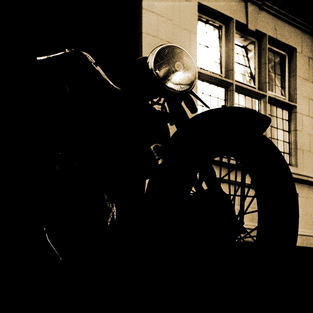
Why over-expose at all? Well, if you don’t have the information present on the negative, then you can’t use it later. I’ve got a picture of a mate’s bike that actually has good exposure – there is loads of detail of the engine. But I chose to render it very dark for effect. I could also render it ‘straight’ and show what make and model of bike it is. But without the exposure that captured the detail I would only have one option.

So what I can say is that over-exposing negative film by a stop seems to work, especially if you then develop in 510-pyro.

Neat trick.

The art of noise

It’s taken me a while to break the 400 ISO barrier, but it turned out the hurdle was in my head. Let me explain… photography and I go back a bit: we have history. Ilford HP5 was my fast film of choice, usually at 400 ISO. I could push it faster, but it got grainy and contrasty. My ideal would have been wide-aperture lenses, but I couldn’t afford them. I had a fairly fast fifty at f1.7 but the widest that any of my other lenses got was f2.8. My longer lenses were worse – I had the usual 80-200 zoom but that was f4.5 wide open. Most sports were out of reach, unless I could get close or it was sunny.

When I finally dig’ed-up it was to an APS-C camera. Delightful though it was (and is) the sensor got pretty noisy above 400 ISO. The crop factor was useful though, as it made my big lenses longer. If I’d put a x1.5 teleconverter of my zoom to get a 300mm, I would have had an f9 maximum aperture. Pop the lens on the digibox and it stayed at f4.5. At 400 ISO and needing a shutter speed of at 1/500 or faster, that made a difference. My exposure table says that’s EV11, so plenty of room for the occasional cloud.

Ugly noise

Even so, I was hitting a limit above 400 ISO. Grain or noise in mono images can be part of the effect, but noise in colour images is less pleasant. I was struggling. A day came when I was planning to take pictures at a race track and needed the longest lenses I owned and the fastest shutter speeds I could get. And then a more modern digital camera strolled up and said “hold my beer”. So I put the camera onto shutter priority and turned on the auto-ISO. And it worked. I was getting good, as in not noisy or grainy, pictures at ISO figures bigger than my phone number. So it’s not all advertising hype – modern sensors really can do high ISO.

Sometimes even flash won’t cut it

The benefit of this is that I can use smaller or cheaper lenses. I had a 35-70 zoom that would previously have stayed at home, as it was only f3.5 at the wide end. It would have meant slow shutter speeds or being difficult to focus with a dark image. But now there’s no problem in using 800 ISO, it lives on the camera as it’s compact and a useful range. I was recently at a camera fair and found a 70-210 zoom that I would previously have ignored, as the aperture ran from f4 to 5.6. But this also meant the lens was not huge: it’s about the size of a soft drink can. Stick it on the camera and it’s not too heavy or unwieldy.

1600 ISO

And yes, I understand that without wide apertures I’m losing the effects of bokeh and background separation. But I’m gaining sharpness by being able to use faster shutter speeds. Besides, a bit of panning will blur the background nicely when I’m shooting action.

6400 ISO

So really it’s a confidence thing. Back in the day I could push film above 400ISO but the results weren’t great. Same with my APS-C digital. But a more modern sensor will do much higher ISO without degrading into noise and fuzz. I’m learning to trust it. This old dog is learning a new trick.

PS Between writing this and posting it I found Joe Edelman’s explanation of why we should not fear the reaper grain. So now I’ve got another little project on to determine the maximum useable ISO of my cameras.

What shape is a picture?

Most pictures are rectangular, except for some fisheye shots. I suppose there’s also the original Kodak No.1 camera, that shot 100 round pictures on pre-loaded film. Those aside, there seems to be no ‘best’ shape for a picture. And by shape, I really mean the aspect ratio: the ratio of long side to short. So the traditional 35mm frame is 3:2 and a square 120 format picture is 1:1. It makes sense – film was a sheet material, and the least wasteful way to cut-up a sheet is into rectangles. But why these particular rectangles?

Look back at the first cameras and they used a wide range of glass plates before they got to flexible film. The glass plate negatives were probably sub-divisions of a standard sheet of glass, hence the half-plate and quarter-plate cameras. The finished picture would be a print, so large plate or negative sizes made it practical to make contact prints. The glass negative could be laid on the photographic paper and would keep it flat while you turned the light on and off to expose it.

I can see why lensmakers would like square film, as it best fills the cone of light from the back of the lens. To use a ‘thinner’ rectangle you either make the film smaller in one dimension (keeping the same diagonal measurement as the square) or make a lens that has greater coverage. But we seem to prefer rectangular pictures to square, which led to all these odd sizes in the first place. As an aside, this may be why aerial reconnaissance cameras shot square negatives: it used all the available image cast by the lens and packaged the negatives with least waste onto a roll of film.

2.3:1 ratio. Good for widescreen.

Originally the reason for a negative was to make a print, as that was the finished product. So I wonder if the various sizes of negative were influenced by the sizes of paper available? I started-out in papermaking, and even at the time we were aware of the variety of ‘old’ sizes and formats. While the mill was mechanised and produced paper in reels, there were still people who had experience of hand-making individual sheets for testing. I was told that “only a real man could handle a double-elephant“, which I am sure was true. These days you wouldn’t even see that at the circus.

Then I suppose came newspapers, followed by magazines. The negative was enlarged for use, so could be easily cropped. So perhaps you either sized the camera to use film that best-matched the dimensions of the final image, or sized the camera to use the most convenient film (35mm or 120).

There were also Kodak’s efforts to gain a monopoly in film supply, by selling cameras that used odd-sized film with various aspect ratios. And I suppose everyone else’s efforts to do the same, or to create the ideal package of convenience and quality.

For some reason the most common sizes of photographic paper were often not a good match for any negative. 6″ by 4″ prints were a good match for 35mm film but 8″ by 10″ didn’t work without cropping. The supposed virtue of the 6×7 film format was that it was a very close match to 8×10 prints, which is fine if the intended result is 8×10 prints. And the ideal use for square 6×6 film? Album covers for vinyl records.

I’m sure I had this album…

And then a large chunk of the world swapped to a rational system of paper sizes. International Series paper has an aspect ratio of 1 to the root of 2, so roughly 1:1.4. Even more roughly 2:3. So the standard 35mm frame would be a fairly good match for these paper sizes. (Nerd aside – the perfect match for ISO A size paper would be to trim 2mm off the width of the 35mm frame and use a 24×34 film gate or sensor.) But we are forgetting projection, as not all images were destined to be printed.

2.5:1 ratio. Good for for Moo business cards.

If you look at cinema, there is a wide range of screen sizes and a multitude of camera or film formats to project onto them. The tension has probably always been between a size of film that fits in the camera and can be practically managed, and the desire to get the biggest, best and most immersive picture on the screen. This probably drove the use of anamorphic lenses, to get the big wide-screen picture using an existing camera and film system (and projectors). But a cinema can change the screen size to match the projection, so that the whole of the frame is seen (you may have seen the masking curtains move when the main feature is about to start). This is unlike print media, where the image is cropped to match the print size.

And then came computers and screens. I would guess that most images are now viewed on screens and never make it to print. The camera in my phone offers square, 3:2, 4:3 and 16:9 formats. The 16:9 ratio matches my computer screen. I’ve also got an app on my phone that shows me the field of view for different lenses on different film or sensor formats (Magic Film Viewfinder).

So what we are left with is a set of historic design decisions or constraints that no longer apply but have become embedded. My older cameras use film sizes that were easy to make or sell in quantity. Other cameras use negative sizes that made sense at the time, like trying to best-fit 8″ by 10″ paper or using a half or quarter of a standard larger size (just as a 5×4 camera uses quarter of an 8×10 sheet of film). APS film cameras were probably a way out of this, as the aspect ratio of the picture could be changed between three settings. There are other cameras that offer variable aspect ratios too, but the reason for them may have gone with the decline of photographic prints.

And look what the cine people got up to. They went for wide aspect ratios, to fill the audience’s peripheral vision and make the film more immersive. There’s talk recently of projecting onto a front and two side screens. I suppose the end point will be VR goggles and the image captured in full 360. And why not, as you aren’t trying to print it? A pal was showing me some 360 filming that was captured by some climbers on the Eiger. Now that’s toe-tingling. There are ways to go wide and 360 on film too, but only a single frame at a time.

You also have to think about the relationship of frame to subject. When we take a picture, we frame a subset of reality. We decide what is in the picture and what is not. We then arrange the items that are in the frame in a pleasing way (which we call composition). But the first action is to set a frame. As GK Chesterton said “Art is limitation. The most beautiful part of every picture is the frame”. The frame is the act of selection. But part of setting the frame is deciding what shape it is. The sharper part of human vision spans about 60 degrees vertically and about 120 degrees horizontally (ignoring peripheral vision). So perhaps a ‘natural’ frame would be 2:1 ratio in landscape format?

So why does my super-duper digital camera have a sensor that matches 35mm film in size and aspect ratio? And why do people pay large money for cameras that work best for 8×10 prints? The ideal would be a circular or round sensor to cover the full cone of light from the lens, and then cropping the picture later to fit the screen or aspect ratio we prefer. We would be returning to the original Kodak No.1 format, but freed from the need to print on a certain size of paper. But when did rationality ever come into it?

The black surround is wasted sensor capacity.

Putting my big light on

I was given some old studio flash gear by a chum. It’s something I had always wanted to have a go at, but never had the money to buy a set. I’ve used small camera flashes previously to try learning the Strobist thing, but I fancied a go at the big jobs with the possibility of using light modifiers.

What I got was two cases, and it turns out, two sets of flash gear. There is a pair of Courtenay Solaflash 2500 units with some reflectors and brollies. The other box has a couple of Bowen Monolite units with brollies, but also a large softbox.

So the first thing I did was to assemble everything from the boxes. The Bowens have a large square softbox that was a challenge to put together. It was obvious that the parts made a softbox but building it was less so. In the end it just took the bravery to bend the arms, as they provided the spring to keep the softbox in shape.

The next thing was to fire them up and see how much light I could get. What’s the point of a big light if it doesn’t give you big light? I’ve had a handheld flash meter for a while, plus there was a Jessops one in the box. And the answer is, depending on reflector, from f8 to f22 at 100ISO. The old Jessops meter and my own one also agreed, which was a bonus.

I did a quick look-up of what I had online. The Courtenays don’t seem that popular, as they are reckoned to be not very powerful and there is a question over the way their trigger leads are wired. The opinion I found was “the trigger is the wrong electrical polarity compared with nearly every other strobe on the market today, being tip negative and positive ‘earth’.” It would be easy enough to make a lead that swaps the polarities, but I prefer to not use long trailing cables – I would be worried about pulling the lighting stand over if I moved. I have both trigger cells and a wireless trigger, so I will be using those. I tried the Courtenays with the radio trigger and they worked just fine.

The Bowen Monolites are a 200 and a 400. The 400 works fine but the 200 just shows a flashing charge light and won’t fire. So at worst I have three working flash heads. They could be as old as 1968 though, so I can hardly bear a grudge.

I will definitely be firing both sorts with a trigger or radio though. The reason is the voltage that comes back through the sync cable. While mechanical film cameras probably didn’t care, more modern electronics can be at risk if the trigger voltage is too high. Searching online says that the Courtenay units reach 18v, which should be safe. The Bowens could be anywhere between 35v and 220v though, which probably isn’t. When I was testing the radio trigger I used the nearest camera to hand, which was a Canon G9. I’d forgotten that I’d set it to use second-curtain flash (it fires the flash just before the shutter closes, not at the point it opens). I thought the trigger was broken at first – there was a noticeable delay between pressing the shutter and the flash firing. Then I realised that the combination of a modest lens aperture, 100ISO and a dim room might give me a slow shutter speed. D’oh!

So the next thing is to work out what to do with them. What I’d like to do is shoot portraits, but I don’t have a line of people waiting at the door. Also, to make portraits I need some lighting set-ups that work. So I’m off to find a wig head or mannequin. For some reason I thought an inflatable mannequin would be ideal: full sized and with a reflective skin so I could learn to deal with highlights. I even had a name for it – Ronan, after the actor who played the body in Blow-Up. But the types of inflatable on offer are definitely NOT the type I want. So a cheap foam wig head it is. I’ll paint it a mid-tone grey or colour if I can find something that doesn’t melt the foam. Oh, and I’ll call it Garth.

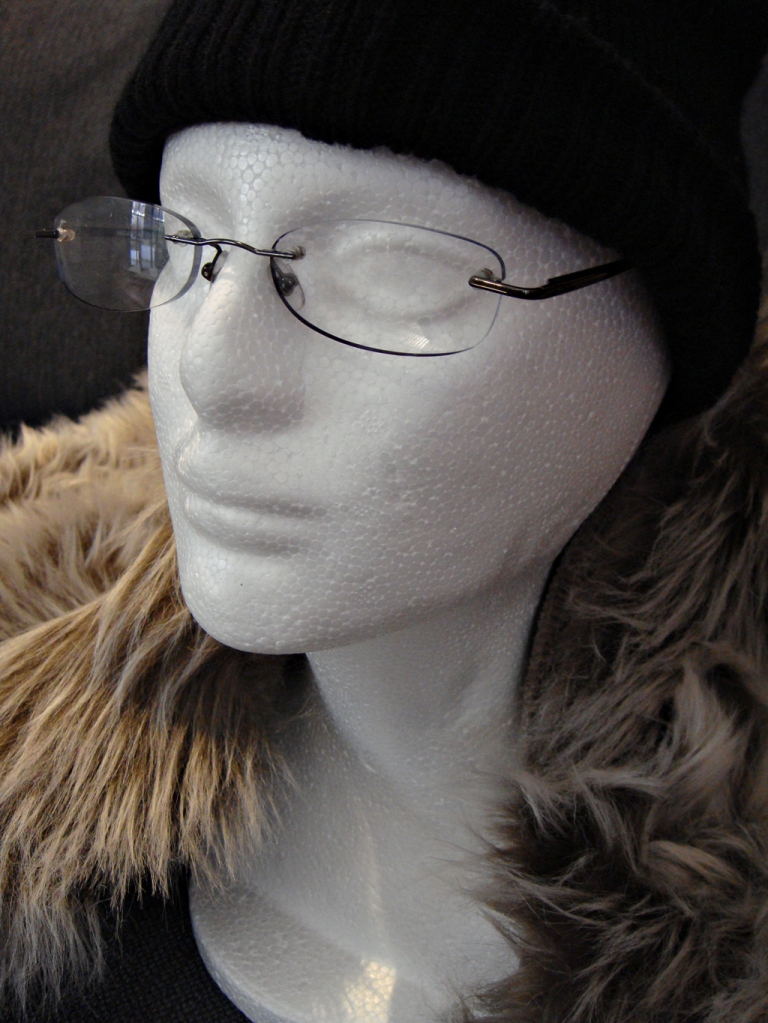
Garth arrived, and was fine-boned and very white. So a bit of makeup is in order. I had some grey paint that was a close match to a Kodak grey card, so Garth got two coats. He also gained some eyes, made with white electrical tape. It gives me something to focus on and will hopefully show when I get a nice catch-light. Garth also got some specs, as learning to avoid reflections would be useful too.

I know it’s a rubbish picture. What would be the point in learning otherwise?

As for what I’m going to try-out with Garth, I’ll go to my little book of answers, where I have collected notes of light placements to get various effects. I’ve also got a copy of Light – Science and Magic to work my way through. This is how I learn stuff – follow my curiosity and try things. It won’t make me an expert, but I will learn the basics and push back, even marginally, the limits of my ignorance.

So that’s me sorted for the dark days of winter. What about you – got anything lined-up to learn about?

The one that got away

Have you ever missed a shot? How about not taken a picture you wish you had? How did you feel about that?

I suppose you could reason that the pictures you failed to take because you were not ready are lessons. The pictures you didn’t see until afterwards are also lessons. The pictures you chose to not take are wisdom.

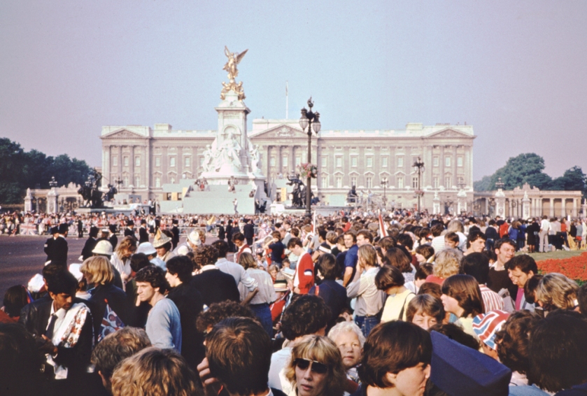
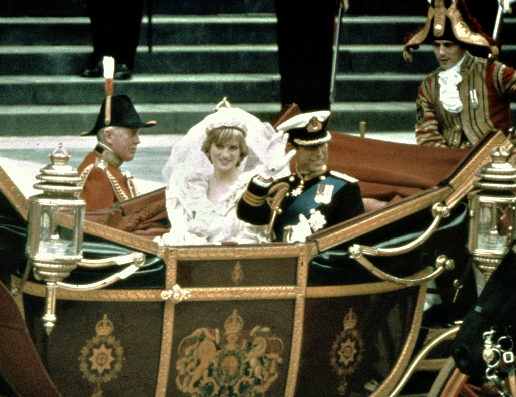
So here’s my lost picture story. What triggered it was finding one of the other pictures I took on the same day, back in 1981. There was a royal wedding happening, I believe. My pal and I were not royalists, and we had decided to ignore all the coverage and fuss. Then, when we were talking, we kind of agreed that getting pictures from the crowd would be difficult, so we should have a go. So we jumped on the train on the afternoon of the day before and trecked to a patch of green facing Buckingham Palace. On the way there we ‘liberated’ a couple of empty milk crates to stand on. It had been such a last-minute decision that my pal had no ready film. He had brought a reel of bulk film in a tin with him, plus a dark bag and some cassettes. He sat swearing on the grass trying to roll-up a load of film with sweating hands. I think I helped him with the healing power of sarcasm.

We got no sleep of course. The crowd kept growing, shuffling and talking and every time we sat down we got trodden on. Then it was daylight and the police told us we were not moving from the spot.

Across on the other side of the road someone had turned up with a stepladder. They climbed up to get a shot over the heads of the crowd of the palace. No problem, until they lined-up a Novoflex lens. These look quite like a bazooka. More innocent times though, or at least less over-reactive. A policeman walked through the crowd, had a word, and the photographer climbed down. The word was probably ‘do that again and one of the snipers on the palace roof will shoot you and upset the crowd’.

So we boiled in the sunshine, wishing we had brought water or food or at least a hat. We cheered with the crowd each time a car went past. Eventually we had the whole horses and carriages thing wind pass and we took a load of guessed shots over people’s heads.

Then another interminable wait. Then the whole circus ran in reverse.

The view from the cheap seats. No snipers visible on the roof, but they wouldn’t be. The colours in the slide film have not aged well.

Once the royals were safely behind locked doors, the police allowed the crowds to flow into the space outside the gates. We grabbed our crates and legged it to the centre. This was elbows work. Then we stacked our two crates, linked arms and stood on top. It was like being the tallest weeds on a windy day: the crowd surged and we wobbled. But we hung on.

And then the people who were the whole point of the day came out on the balcony. I fired a few shots but didn’t have many left on the roll and didn’t want to change film on my precarious perch. And then it happened – the couple looked at each other, leaned in and kissed. I got the shot. I believe that very few of the press photographers got the shot, which is odd but true.

Just before the kissy bit

Except… every arm in the crowd went up and everybody either jumped or moved to get a better view. It would have been a grainy picture of people you would only have recognised from their context, but at least I might have the picture. Of course, this was on film, so I had no idea until afterwards.

Then we were both out of film, so we stepped down from the crates and away from the fight that sprang-up to take them over. Then it was more sharp-elbow work to get out of the crowd and away to the railway station.

The train journey home was a nightmare. Home was not the end of the line, so we had to stay awake. The sun beat through the window. The train made a rhythmic clacking noise. I dozed off and woke up with a start, my face covered in dribble, under the gaze of the girl sat opposite. She didn’t ask for my phone number.

I had been shooting colour slide film, so off it went to the processor. After nearly a week the plastic box arrived back in the post. Remember those days? And there it was, the picture I had seen through the viewfinder and hoped wasn’t ruined by a shove from the crowd. Hoped in vain – it looked like an Ibeza disco-frenzy of waving arms and bobbing heads. One of my first fuzzygrams.

Oh well, let’s call it a lesson. The milk crates worked very well, although a folding step might have been easier to carry. But the milk crates were probably more resistant than a step to all the people that walked into them. I should have thought more about what they might do on the balcony, as I could have better anticpated the shot. These days I would take a longer lens, but in those days I didn’t have one. Oh, and carry water and food as well as film. These days I would also wear steel toe-capped boots if I was going to be in that tight a press of people.

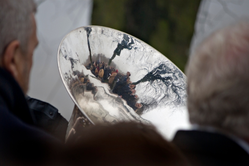
And having done this one, I never went to another royal event. Just look at the people in the balcony shot and work out how many events have happened since. But saying that, I must correct myself – I went to one event that was royal, but just round the corner from my house. We all turned out for the Jubilee to shout ‘up the Queen’ and get hammered. I didn’t get any pictures of nobles snogging at that event either but the local ukulele band made up for it with their enthusiastic playing of unrecognisable tunes. There’s a few lessons there, too.

Looking sideways

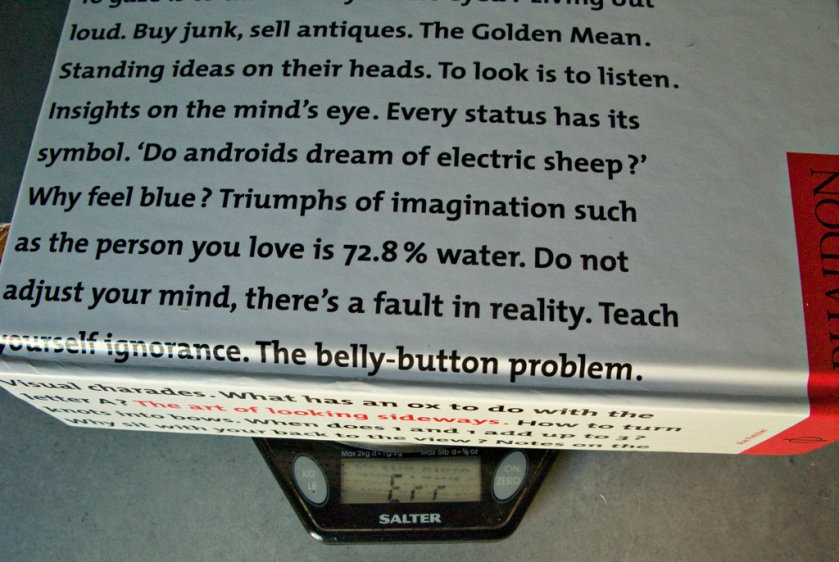
If you want to see things differently, you have to look differently. Looking differently is hard though, so any help is good. May I recommend to you the best inspiration and guide I know? Alan Fletcher, who was a creative and prolific graphic designer, spent 18 years compiling a collection of curios, prompts and resources about creativity and design. His book, The Art of Looking Sideways, is a delight.

It’s not my brother*

Photography doesn’t stand alone – it has links to every visual art. If, as a photographer, you only look at photographs, you will be missing a world of links and influences. So it makes sense to look at other visual art. Painting and drawing are good and very relevant to the concerns we have for AI-generated pictures. Artists have always created pictures of things that don’t exist. It’s only photographers who got caught on the hook of “the camera never lies”. So here’s a treat – a whole great big book full of ideas of how things could look and how to look at things.

This is what you get – 533 pages on these themes:

The book is chunky – more than 2kg in weight – so you may not slip it into a pocket to browse in spare moments. I find though that I start reading at a random page and fall off the world for a while. Recommended. And there’s time to get one for Christmas.

* see here for explanation

Penny plain

“The greatest thing a human soul ever does in this world is to see something and tell what it saw in a plain way”.

That was John Ruskin, and he knew a thing or two.

This takes me back to my ramblings about ‘fine art’ photography, where I argue that photography can be art, but using the word fine is pretentious. Ruskin, I think, is talking about communication, and photography does this too. Leaving aside the art, meaning interpretation, we have the communication of an idea, a situation or a story. What I think Ruskin said was to communicate simply.

I have encountered this in technical writing, where I am trying to impart a conclusion and a proposed outcome based on evidence. The problem here is the curse of knowledge and the missing thread. The curse of knowledge is that the writer knows a lot about their subject and skips the explanations or the steps that lead to a conclusion. I could tell you it’s a mistake to fit the mains sensor that triggers a backup generator on the output side, or I could describe a mains failure followed by a series of brrrrrm-click noises. Either way, it depends on you having some idea what a backup generator is and does. The curse of knowledge would be to assume you know what I know. How would that work in photography? Probably by assuming the viewer knows the context of a picture or about the people in it.

Speaking of context…

You can play the Tapping Game to experience the curse of knowledge for yourself. One person thinks of a tune and taps the rhythm on a table. The other player(s) have to guess the tune. It’s obvious to the person tapping and impossible for the listeners. (Unless you cheat and tap in Morse).

The missing thread is when you lose or bury the main idea and the steps that lead to it. Journalists call it burying the lede. Throwing all your research onto the page can lose the conclusion, for example. Telling the story in the wrong order can lose the power of story-telling. In photography it would be including things that are not the subject or the story or not being clear what the subject is. I think this is a key part of what Ruskin said: make the message clear and easy to see. To quote someone else – “everything should be made as simple as possible, but not simpler”. So perhaps that is part of the art of photography, to show and tell as clearly and simply as possible? And if we’re in the quoting mood, let’s have some Piet Hein:

There is 
one art,
no more,
no less:
to do
all things
with art-
lessness.
What’s the story here?

So good advice all round from Mr Ruskin: show clearly what you mean, as simply as possible. Well, that’s most of my pictures in the bin. I will try harder (just like all my old school reports said I should).

PS – The title comes from “penny plain, twopence coloured”. Source.

Shootin’ the blues

It all started when I took some pictures of people on a normal black and white film, that looked like they’d been shot on ortho.

Now, ortho film is not sensitive to red light, so it renders red dark and blue pale. If you use it for male portraits it increases skin texture and gives a more rugged look. The opposite would be to shoot with a red or orange filter, which removes freckles and blemishes on pale skin.

But what I got was a bit of ortho effect – skin texture and freckles were more noticeable. This was not what I’d been expecting.

Not sure how well it will show-up, but the subject’s freckles are more pronounced and his beard and hair are darker.

I’d been shooting a roll of Agent Shadow 400, so I contacted Stephen Dowling in his hollow volcano lair to ask if the mystery emulsion might be a bit blue-sensitive. He assured me that the top-secret research facility that produced his film said that it was panchromatic. Why would you want anything less for a secret mission? So the ortho effect was a puzzle.

Earlier shot under ‘normal’ lighting

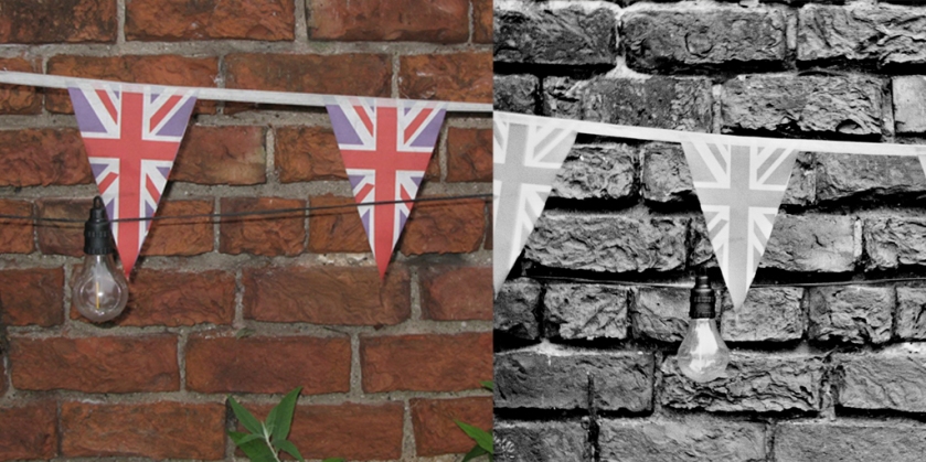
I’d also shot a couple of ‘end of roll’ pictures on the film, one of which was some bunting against a brick wall. When I looked at this, there was no difference in tone between the red and blue parts of the bunting. So the film really was panchromatic.

Then the penny dropped – shadows under an open sky are blue. I had taken the portraits under a clear blue sky, but in the shade. My subjects were lit with blue light. So my panchromatic film faithfully recorded the tonal shift caused by the lighting. And yet I know full well that colour pictures look blue in the shade. I’ve not seen it before on mono film though, either because I wasn’t looking carefully or because I rarely go out in sunlight.

Shadows really are blue

So there you have it. If you want an ortho effect to make (usually) male (pale) skin more rugged, shoot in the shade under a blue sky.

Design a site like this with WordPress.com
Get started